Defining the art style of Ganbatte
In this second development blog post we would like to give an update on our process of defining Ganbatte’s art style. We’ve looked at different styles that would best fit the theme of the game, as well as the skills and size of our team. We’re not ready to show the style in-game yet, so this post is really about our process, rather than the result of it.
What are the most important stylistic and visual aesthetic elements of Ganbatte?
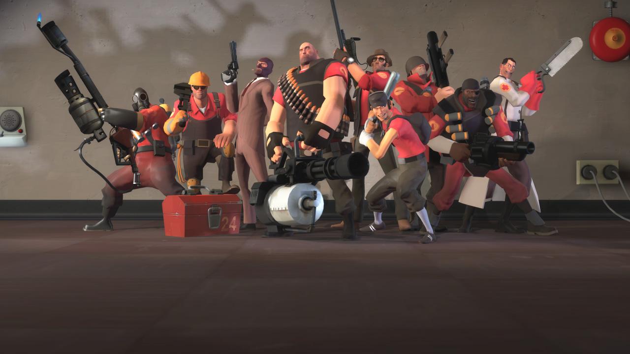
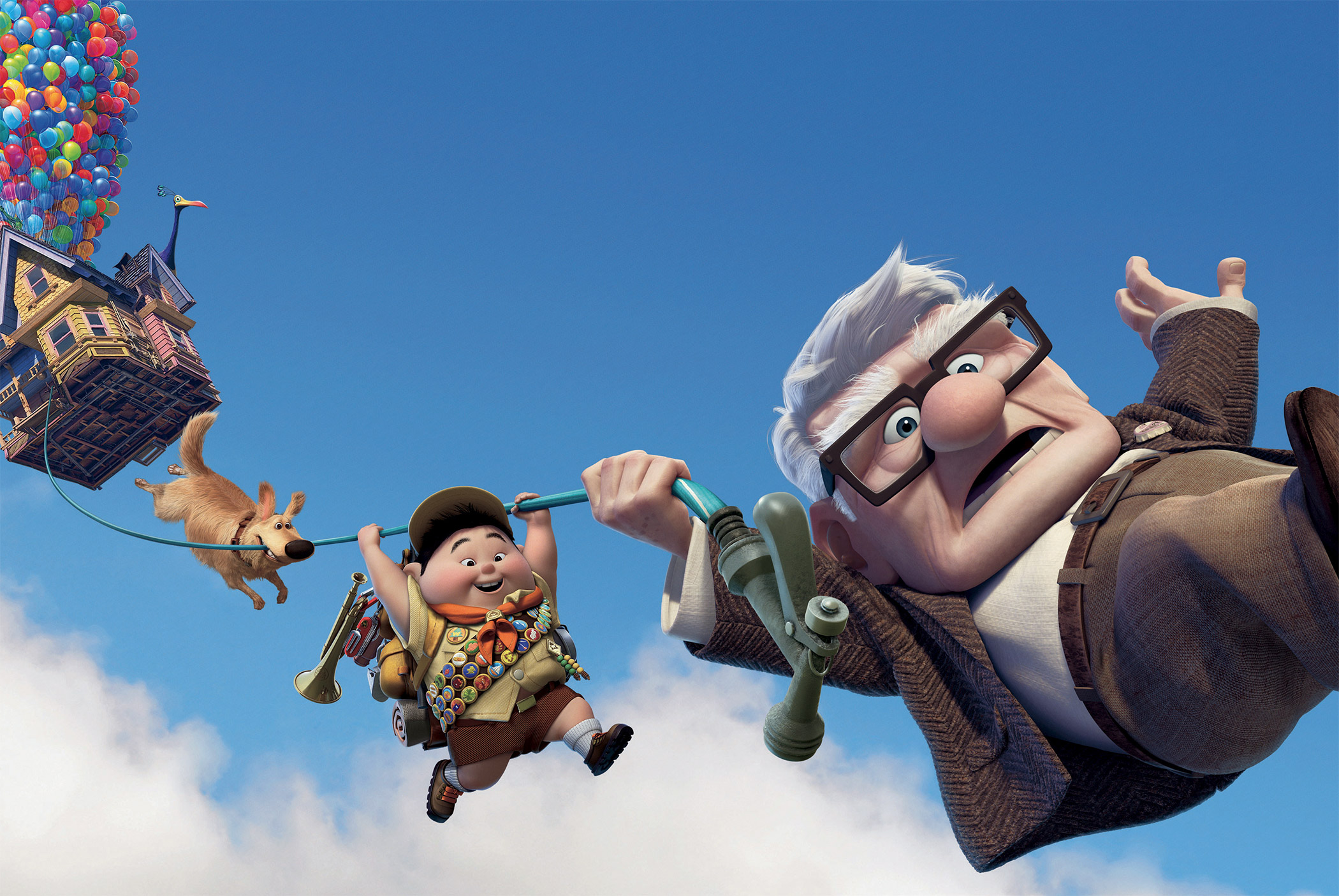
In short, Ganbatte’s visuals are a mix between Team Fortress 2 and Pixar’s UP! In other words; stylised and soft shaded.
Research
To define the art style of Ganbatte, we researched a combination of various art styles seen in other games and media, and we got inspired by different aspects of each style, and we mixed and matched to fit best the type of game that we are building.
It’s important to note that we want the game to stand out, and be highly polished visually. It’s also important to note that in our discussion we realised that we wanted to avoid making a Job Simulator type of look. For the record: we’re huge fans of Owlchemy’s titles and have deep respect for their contributions to the medium of VR. Unfortunately, their success also means that their visual style, mostly characterised by simple lighting, relatively low poly, cartoony models and bright colours, is copied a lot, and is common in shovelware seen on Steam. Besides, we wanted something unique!
Stylised
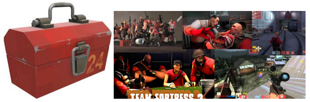
In principle, Ganbatte will be “stylised”, similar to Team Fortress 2. The most important takeaway for this style is the fact that shapes can be caricatures, with exaggerated features. This applies to objects, the world and even characters. A good TF2 example is the toolbox, which is more narrow at the bottom, and wider at the top. An example of this for Ganbatte would be the sushi pieces, which have its features a bit exaggerated (more about the design of Ganbatte’s sushi in a future post!).
Simplified shapes
The game will not be realistic, but it won’t be distinctly super low poly either; it will be a simplified version of reality. The game will not be square, voxelized or blocky, it will also not have hard edges – but shapes will be brought down to their essence.
Minimalism for the galaxy
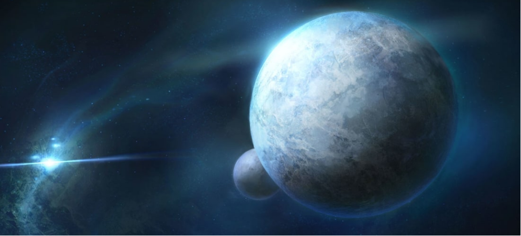
In general, the game will feature no minimalism, except in the galaxy. The universe, the view outside, the space environment, will feature some planets/moons but will not have a lot of details, since the focus of the game will be on the sushi and your cat opponents.
Vivid colours for the Characters
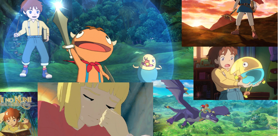
The characters in Ganbatte will stand out by using vivid colours. Where the background will be more uniform, it’s the characters that will really “pop”, similar to a toon look, like in Ni No Kuni.
Characters using 2D textures for expressions
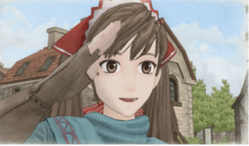
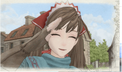
The cats will have changing expression through the usage of textures in an anime style. The face will not (or hardly) change its 3D geometrical shape. This method will make it easy and cost effective to create many expressions and dynamic characters. Similar to the look of Valkyria Chronicles.
Characters will have textures for details
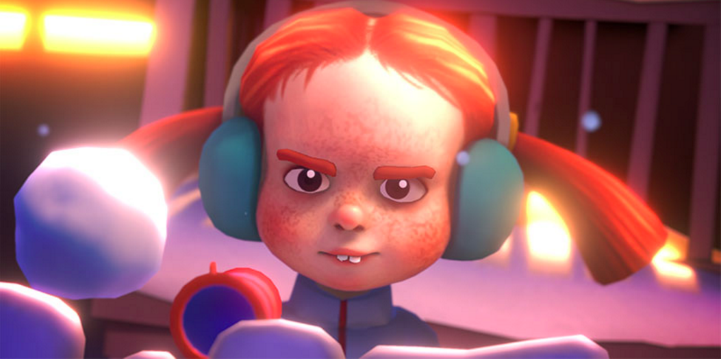
Besides the eyes, the cats will have textures for their face/body/coat/hair to give them more detail and make them stand out more. A good example of this are the human characters in a small VR game that we love: Merry Snowballs (if you like snowball fights, check the game out here!).
World/Environment: no textures
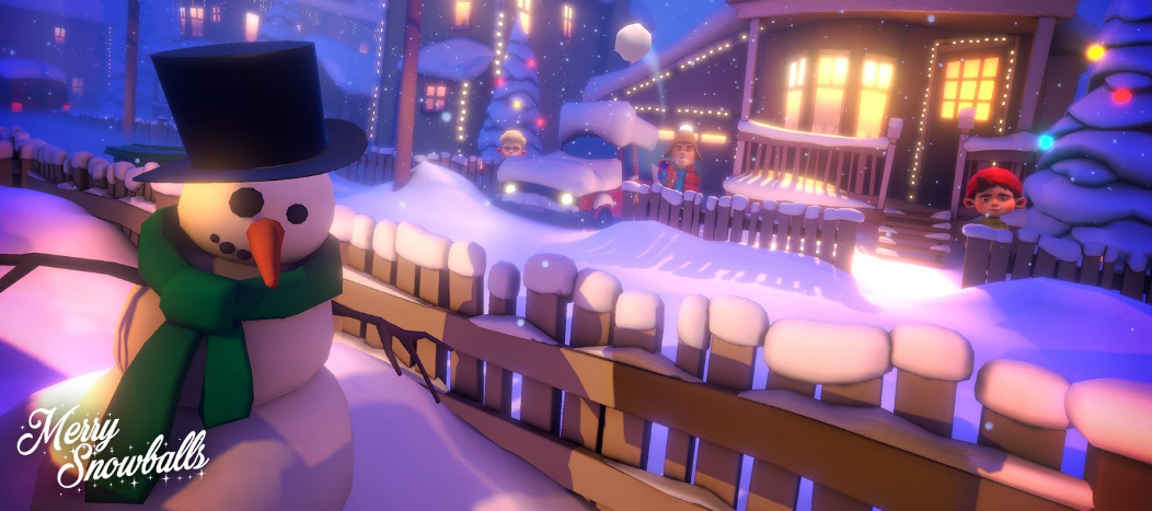
The game world will not have any diffuse texture maps. The style of the environment and world is mainly influenced by the object’s shape, colour and intense usage of lights and shadows. The main reason for this design decision is that, in VR, the form and silhouette of objects are super important, perhaps even more important than fine texture details. An example of this visual style can be seen in Pixar movies, but also in Merry Snowballs. We will create this look for the world, with a particular focus on heavy ambient occlusion and soft shading with no, to minimal, reflective surfaces. It will give a Pixar like style to the world, and it has the added benefit of saving us some time in making the assets.
Lighting: soft + bloom + dust
The look and feel of lights play an important role in the game because it can make the player feel at home and guide its attention. The game will feature a lot of heavy bloom effects to give a softness to the lights.
Also, there will be dust particles in the air to provide a high sense of presence, utilising their parallax effect, enhancing the feeling of immersion.
That concludes this week’s update about the process and reasoning behind Ganbatte’s art style. We’re working hard on building the world and applying these style guidelines, and we can’t wait to show you the results!
Thanks for reading and until next time!
-Thomas
